Role
Senior Product Designer,
UX / UI
Timeframe
8 months

"Research studies indicated that users want a weather radar-centric experience that simply focuses on improving accuracy, forecasting, and detail rather than new 'mass-market' appealing features. Users showed the most interest in advanced precipitation and severe weather tracking whereas features surrounding editorial, health & wellness ranked lowest."

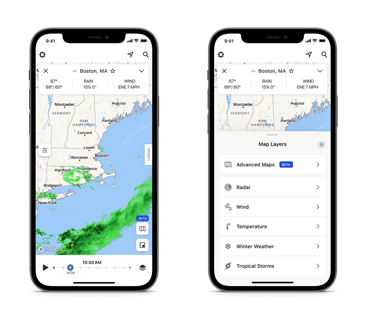
Considering the Main Radar Experience
As mentioned earlier, the existing interface had not been updated for quite some time due to limited resources. The design system needed a revamp and the Beta was the perfect opportunity to do so.
During a previous project, we had improved the UX of the main layers menu by implementing an Apple sheets inspired design to help enhance the usability. It had proven to be successful, so I made sure to keep that in mind when working on the initial designs for the beta.
Maintaining a familiar interface was essential. Established patterns made it easier for users to adapt to the beta experience.
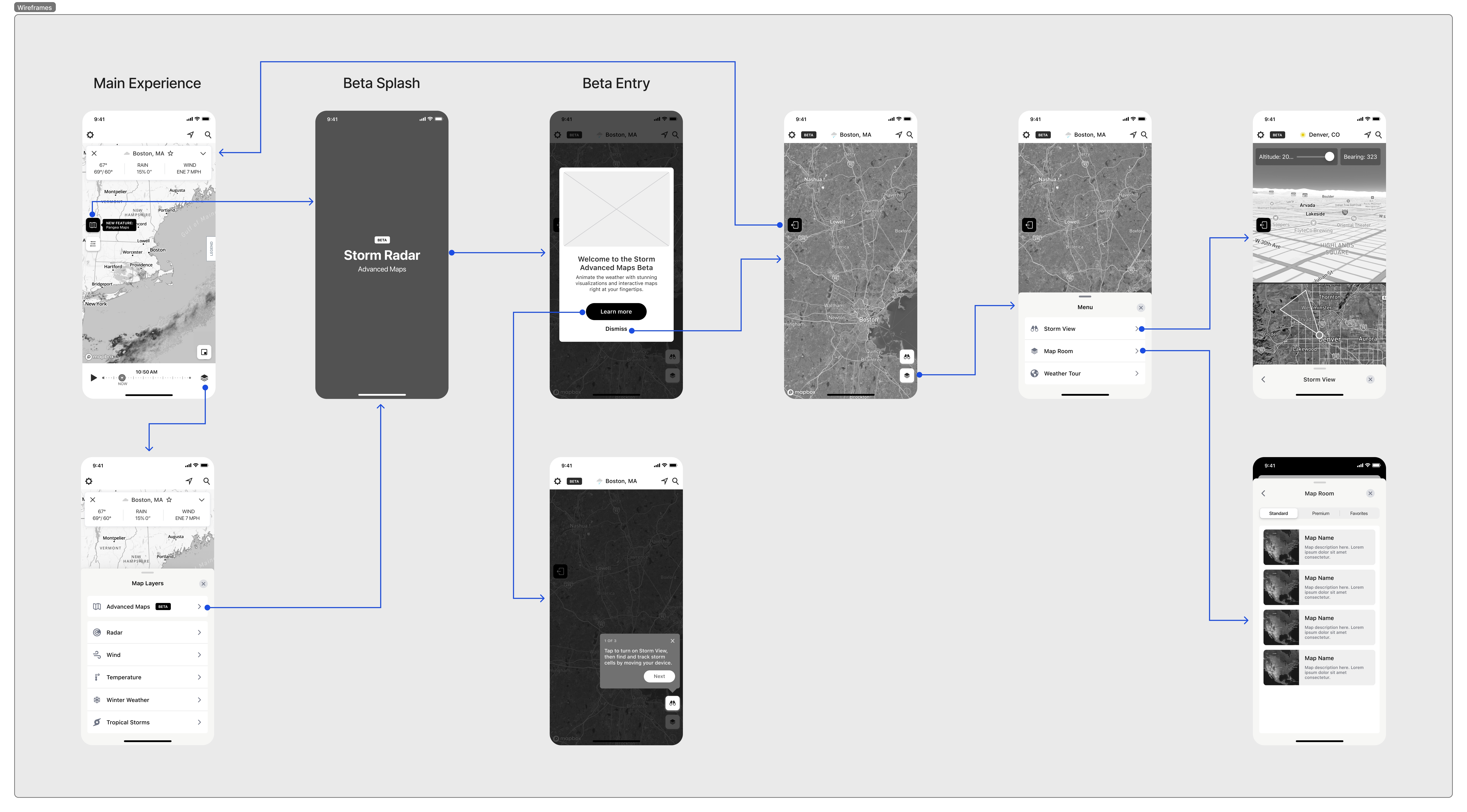
Home Screen Radar
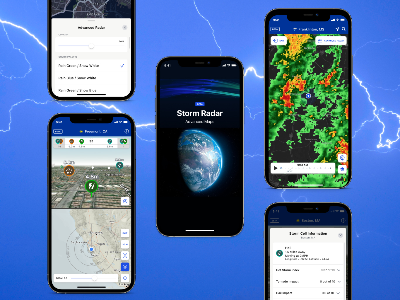
For the main radar screen, I introduced a dark blue top navigation bar to clearly signal that users were in the beta experience. I also added a timeline scrubber, allowing users to animate the map and view forecasted weather.

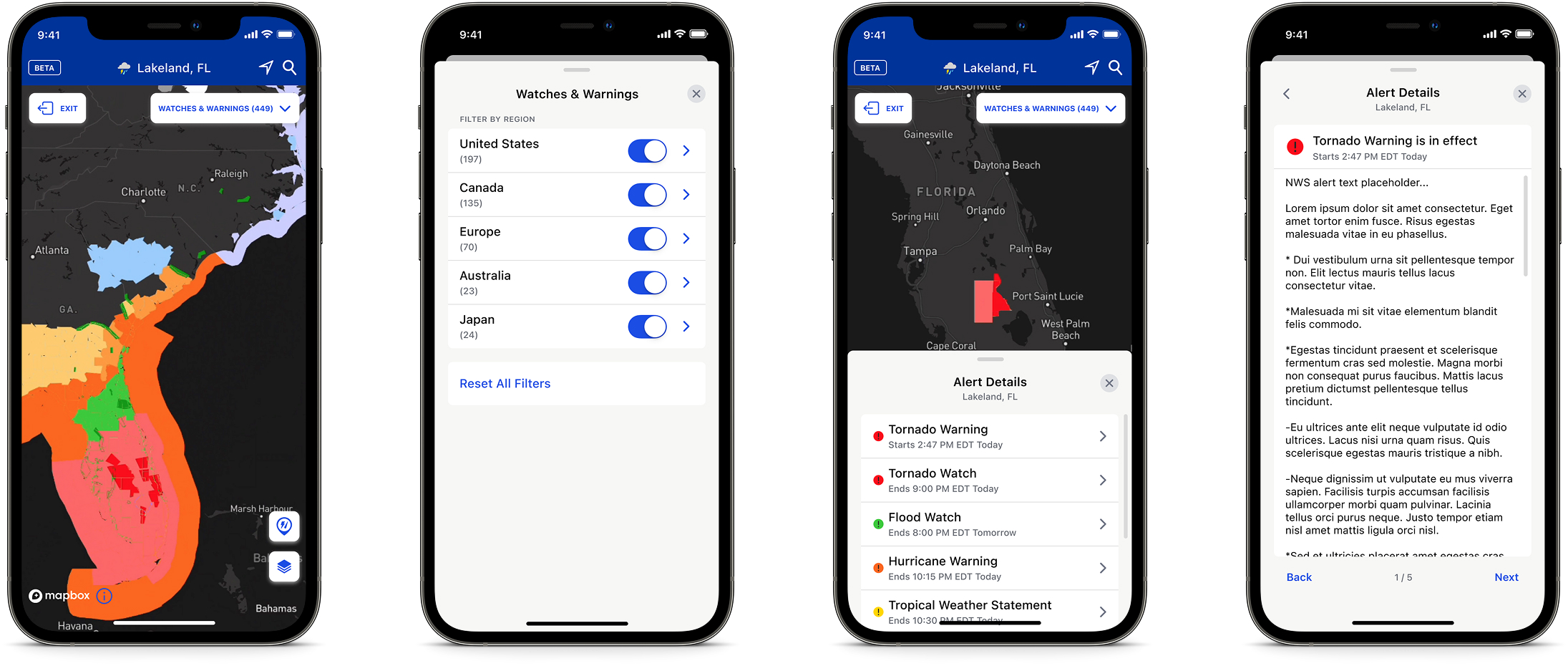
Watches & Warnings
This advanced map allowed users to filter watches, warnings and other alerts from government sources including the National Weather Service. Users could filter by region, alert type, and severe weather.
When selected, the map uses a color coded system to display active alerts. Users could tap a highlighted area to pull up a sheet that showed all of the active alerts for that location. If there were multiple alerts, the user could easily shuffle through the descriptions to quickly scan for important details.
Accumulations
This map displayed accumulated rain and snowfall, for up to 72 hours in the past and future. Users could press and drag their finger around the map, as the precise accumulation type displayed data for the area within the crosshair.
There were a handful of usability factors to consider when designing this map. I knew we needed to provide users with a legend that was collapsible for quick references. Another challenge included the consideration of how the map interface would change when users set it to display observed versus forecasted data.
Observed data shows past accumulation amounts, and adding a timeframe carousel allowed users to easily switch between previous periods.
Forecasted data displays future accumulation amounts, and instead of a timeframe carousel, users could scrub the timeline to see predicted amounts of precipitation.

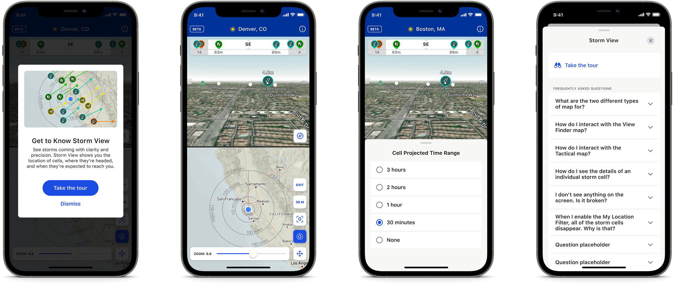
Storm View
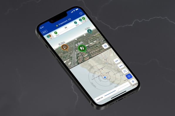
This distinctive feature let users view storm cell data in real time through a split-screen map layout.
The View Finder map gave a real-time visualization of the user's area. The Tactical map showed a top-down view of storm cells within a 150-mile radius.
We introduced several new controls and icons for this feature, so we added an optional product walkthrough and an FAQ section to help users get oriented.
What The Users Said
The below reviews were captured from the App Store:
"I’ve tried countless radar apps. This one is the best! I love the accuracy and the beta lab features too. I’m a power user in the USA. For me, nothing beats this app.
"Love Storm Radar! I really am enjoying the beta version too. Always very accurate on the forecast. The radar is outstanding! Can time my chores outside to the radar down to minutes before rain starts.
"I have used them all. I work both in the US and around the world (literally) and this is my go-to app no matter where I am. The radar interface is solid and the long range forecast is so helpful. It is not cluttered with extraneous graphics and you can add layers to what you see very easily. Great product!!
What The Data Reported
The below data points were captured three months after launch:
Success Metrics
The below metrics were captured three months after launch: