Role
Senior Product Designer
The Weather Channel is the world's most accurate forecaster and America's most trusted news source. The mobile app is consistently ranked #1 for weather in the App Store, with millions of users looking at its daily forecasting.
The Problem
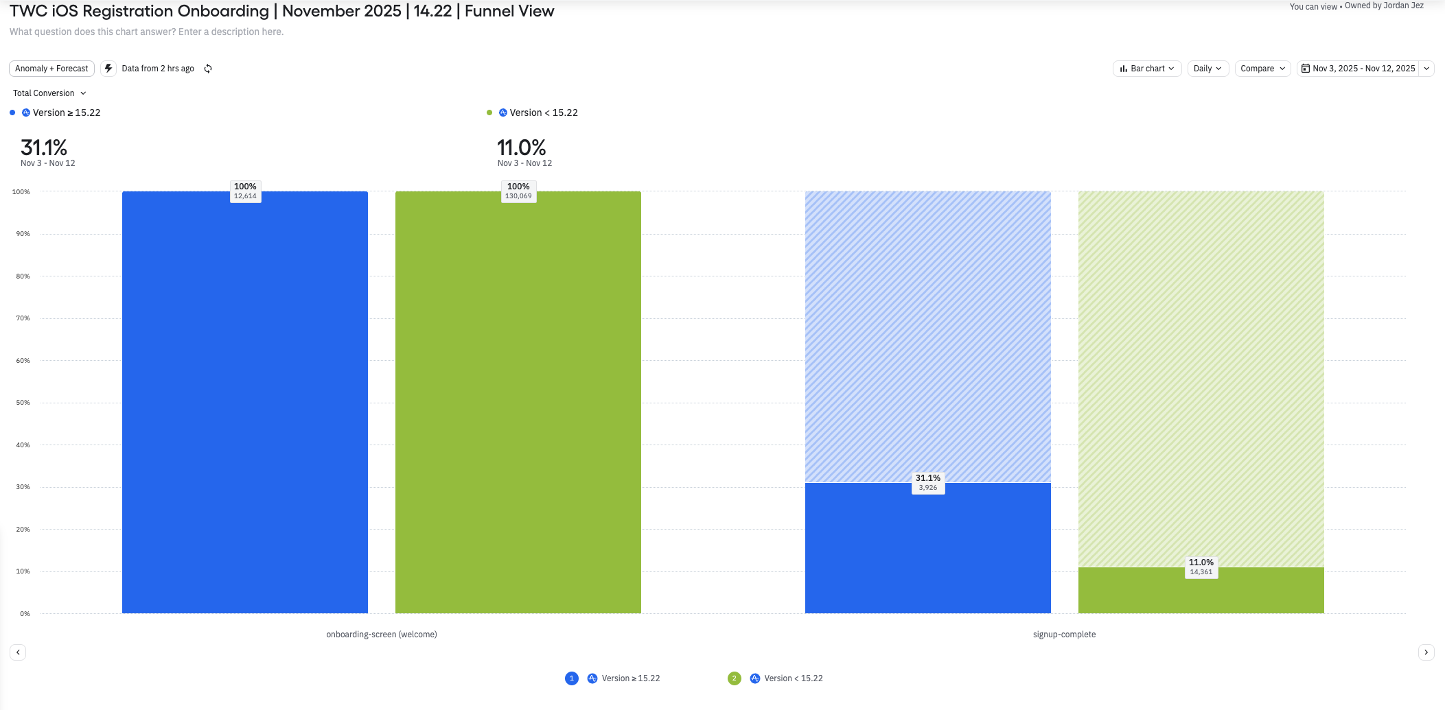
Registration during onboarding was at an all time low with only 11% of users opting in to create an account. It was also reported that opt-in rates for notifications and location sharing were quite low as well.
The existing onboarding flow lacked contextual value propositions to explain to users why it was useful to enable such settings. The flow also had users go through the entire sequence before arriving on a sign up screen which felt like a backwards mental model.
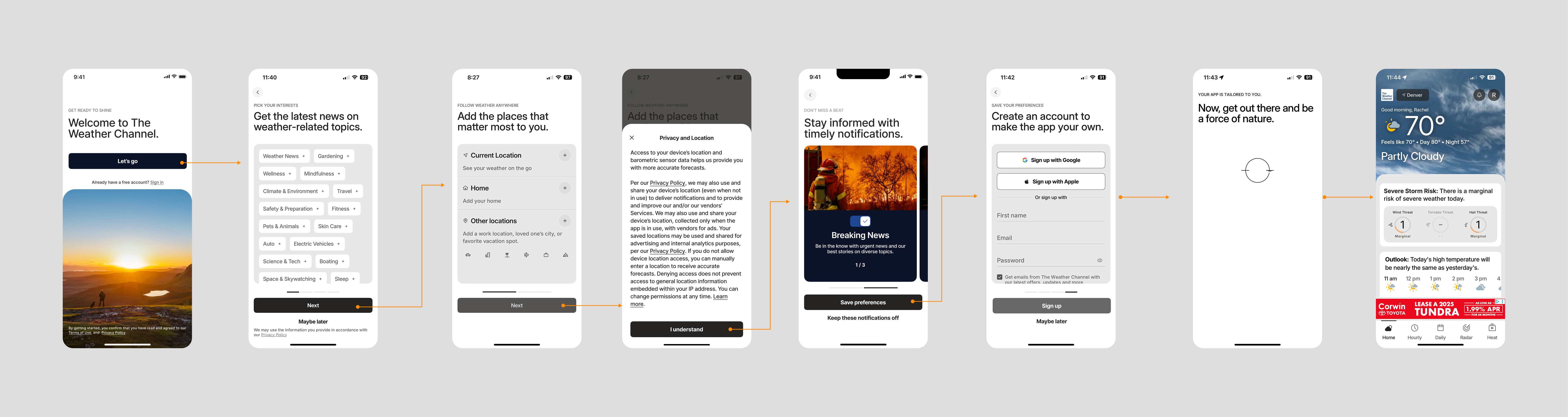
Original onboarding flow used as the control for testing.
The Solution
For months, we ran extensive A/B testing with GrowthBook to better understand what drives user registration and feature adoption. The data was clear, our onboarding flow needed a refresh.
The redesigned onboarding experience would apply these learnings to create a registration-first flow that better balanced user needs with business objectives.
High-Level Project Goals
1. Drive user registration
2. Boost location sharing consent
3. Increase notification opt-in rates
4. Mitigate bounce rates to maximize revenue
Product Design Strategy
• Create a more intuitive onboarding flow by streamlining steps
• Reduce cognitive load through concise messaging, purposeful imagery, and clear calls to action
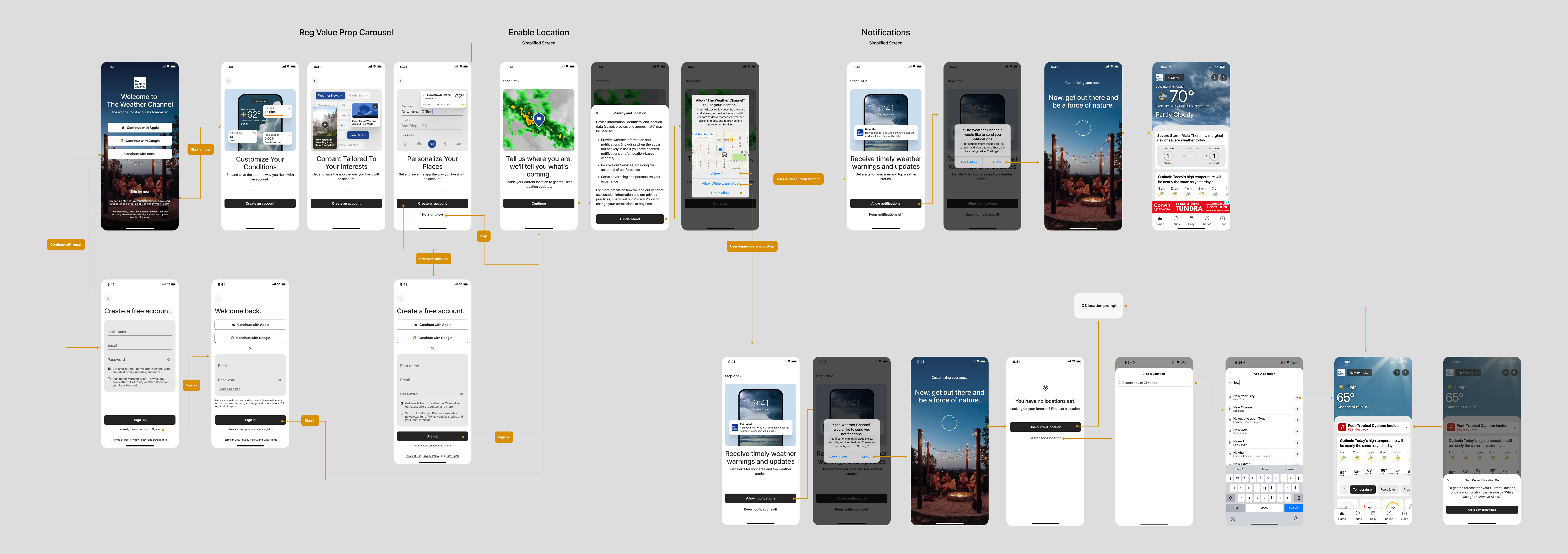
• Reinforce the value of registration with a contextual value proposition carousel for users who initially skip account creation
Why focus on registration?
The emphasis on registration comes down to one simple goal — it helps better personalize the app experience for users. An account creates opportunities to bring users back through the use of personalized notifications, saved locations, and relevant updates. This can encourage habitual use rather than one-off visits, therefore increasing our Daily Active User metrics.
A registration-focused onboarding experience also provides valuable first-party insights into user preferences and behavior. These insights can inform product improvements, lifecycle strategies, and more personalized advertising to support revenue growth.
Soft-Gating the Welcome Screen
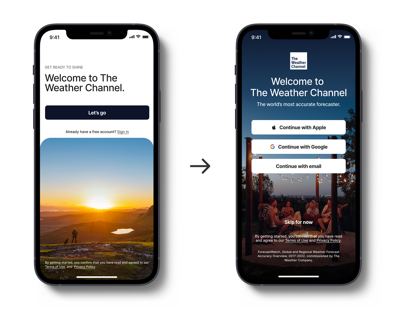
We conducted A/B testing on the welcome screen, the first screen users see when they open the app. The control screen only had a 10% registration opt-in rate.
Early experiments with this screen included:
→ Testing different visuals and layouts
→ Variations in copy and button placement
→ Soft-gating sign up, which meant letting users skip it
→ Hard-gating sign up, meaning users were required to create an account
The soft-gate experiment proved the most successful with registrations rates increasing 25% over the control.
Hypothesis
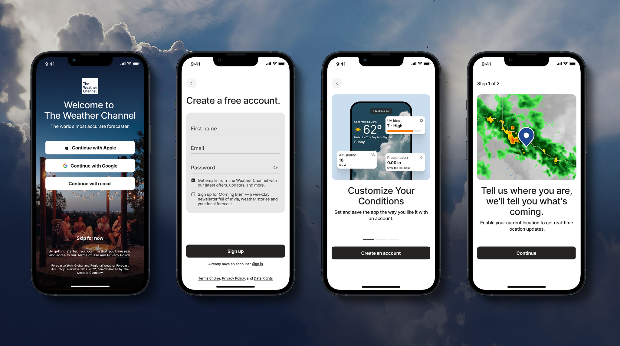
Put registration on the first screen and let it be the first choice users make before we ask them to do anything else. Add recognizable branding and imagery to make the intro screen feel immersive.
Below you'll see the original welcome screen on the left, and the redesign on the right.
Registration Value Propositions
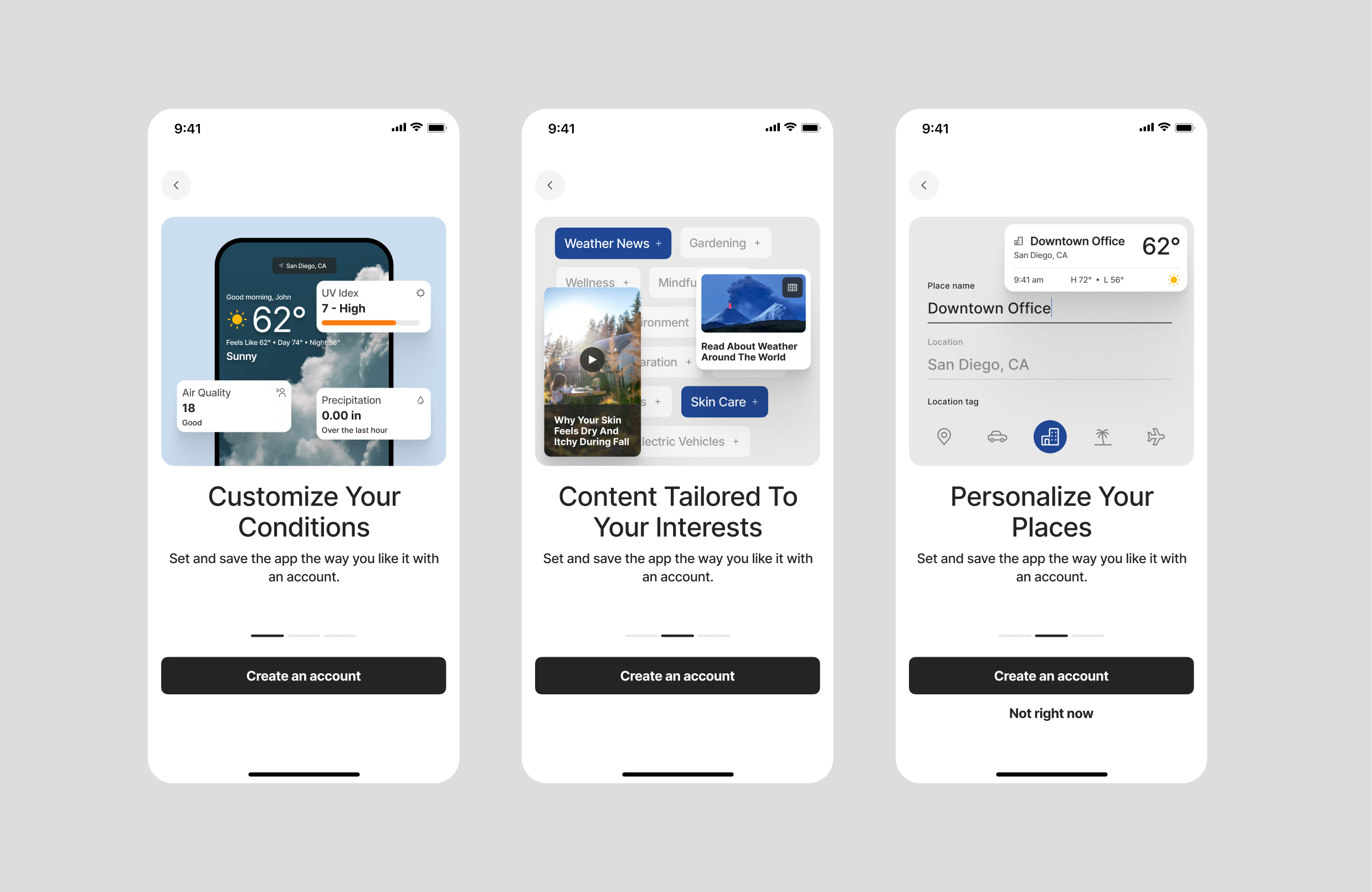
The previous onboarding screens lacked compelling upfront value propositions to make the case for registering. Without context, users were confused as to why the app was asking them upfront to pick topics of interest, save locations, and enable notifications.
Hypothesis
Users who skipped registration on the first screen, would be routed to a carousel that makes the case for account creation. This visual approach makes our value propositions clearer and more valuable to new users. The carousel would have an animation that shuffles through the three main value propositions. After a slight delay, the "Not right now" button would appear.
Simplify the Enable Location Screen
Metrics from the existing location screen helped us understand user behavior and intent during this step. During a user's first seven days in the app:
→ 13,229 users reached the location screen (89.3%)
→ Of those users, 58% enabled location services for their current location
→ Only 6.7% of users added more than one saved location
It was clear that users only wanted to enable location services for their current location. Asking them too early into their experience to add extra locations was making it a cognitive overload issue. Users were eager to get through onboarding to see their forecasts.
Hypothesis
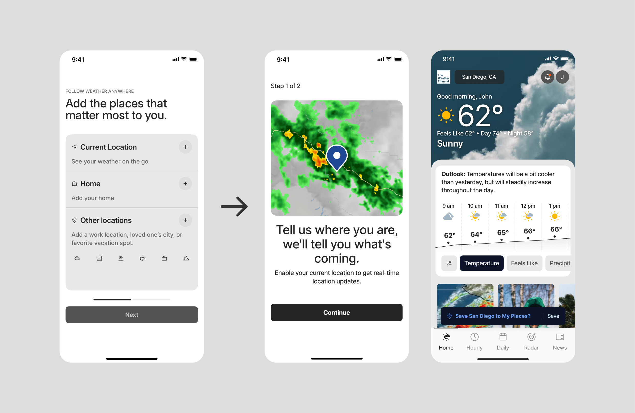
Put more emphasis on why GPS location helps provide a better experience to users. We would opt them into certain notifications based on their current location. One clear call to action might increase the probability of the user enabling location tracking.
Since metrics for saving additional locations was only at 6.7%, we wanted to put the feature into a more contextual flow. On the homescreen, a user could search for a new location, and we'd prompt them to save it at that moment.
Below on the left is the original enable location screen, and the redesign to the right.
Simplify the Notification Opt-In Screen
The existing notifications screen had users swipe through a carousel to opt into different notification types. Based on current Amplitutde metrics, there was clearly signs for improvement on this screen.
→ The current opt-in rate was only at 21%
→ 62% of users surveyed were unaware that they would receive a daily forecast push notification if they opted into receiving them
Hypothesis
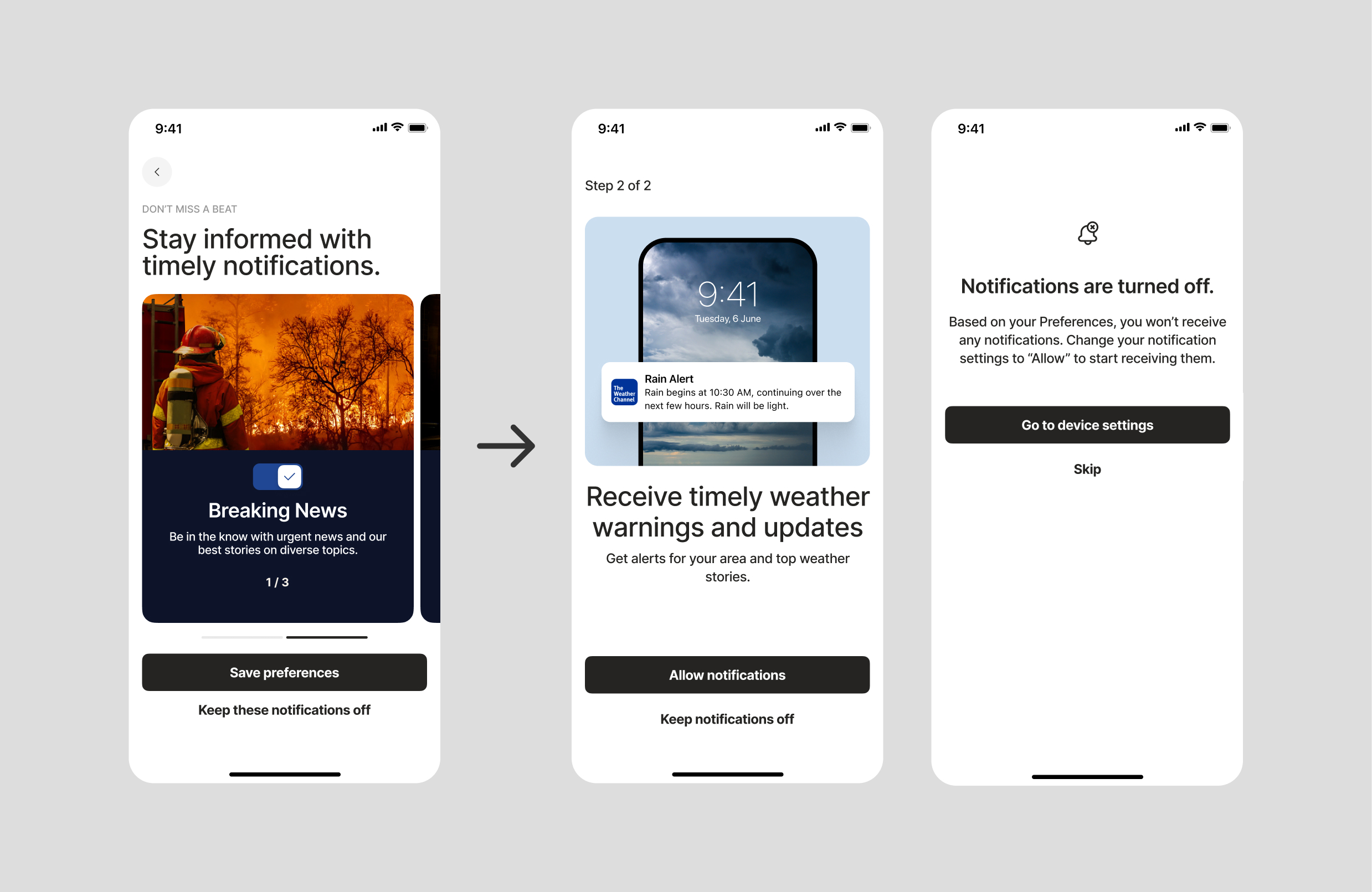
Change the call to actions on this screen to one single button, which would reduce decision paralysis. Use contextual imagery to help explain to users what they're opting into.
The screen on the left is the original design with the carousel. The screens to the right show the redesign as well as an alternative screen for users who have all notifications turned off in their iOS device settings.
The Full Onboarding Flow
The full onboarding flow below shows how the experience changes based on user behavior, with different paths depending on the choices users make.